Cix Health
I currently work at Cix Health, a tiny startup located in Richmond, VA. On a team of 9, I am the Lead Visual Designer (former Lead UX/UI Designer). My day-to-day includes supporting and collaborating with our lead UX/UI designer on our product side, illustrating, building our brand and creating our guidelines, and working closely with our Content + Marketing Strategist to bring our sales decks, one-pagers, social posts, and emails to life!
This role is unique to any I have had, and in many ways, a rare opportunity to fully own the brand identity of a product.
Since joining Cix Health in 2021, I have been working behind the scenes to come up with a refreshed look and feel for the company. There was no style guide or branding to work from when I started. Given the small nature of our company, more often than not, we are fixing features, switching gears to accommodate client requests, and squashing bugs, leaving little time to tackle bigger list items. That means that rolling out a style guide and new branding has to happen in parallel and these updates make their way in slowly.
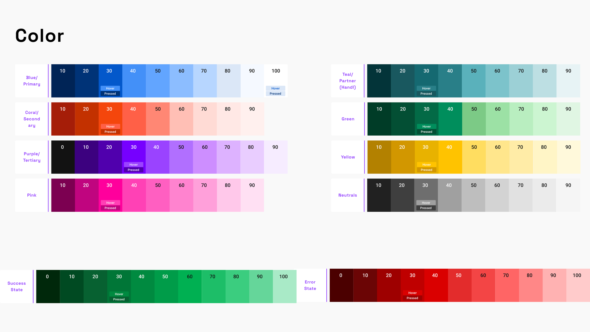
Color Palette
Something I remember most about joining the team was hearing how our app was meant to feel like a family member or friend helping out on a health journey. The app should feel welcoming, familiar, and like a positive experience vs. something clinical and sterile. I loved areas of the app that showed fun illustrations and moments of gamification, but noticed that the colors felt oddly similar to those at a Minute Clinic I had recently gotten my flu shot from. I brought this up to my boss who agreed, so I began to put together a new palette.
The original palette lacked warmth and felt pretty muted with some areas of high saturation that didn’t seem to fit.
Using a similar range of colors as the original, I tweaked, added and built a new palette that felt lively, fun and welcoming. Success and Error states were added along with Neutrals.
Iconography
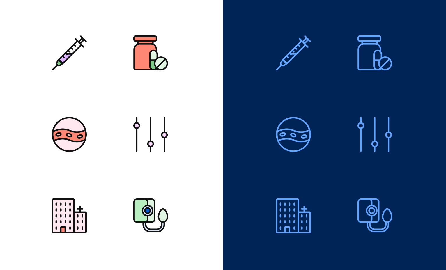
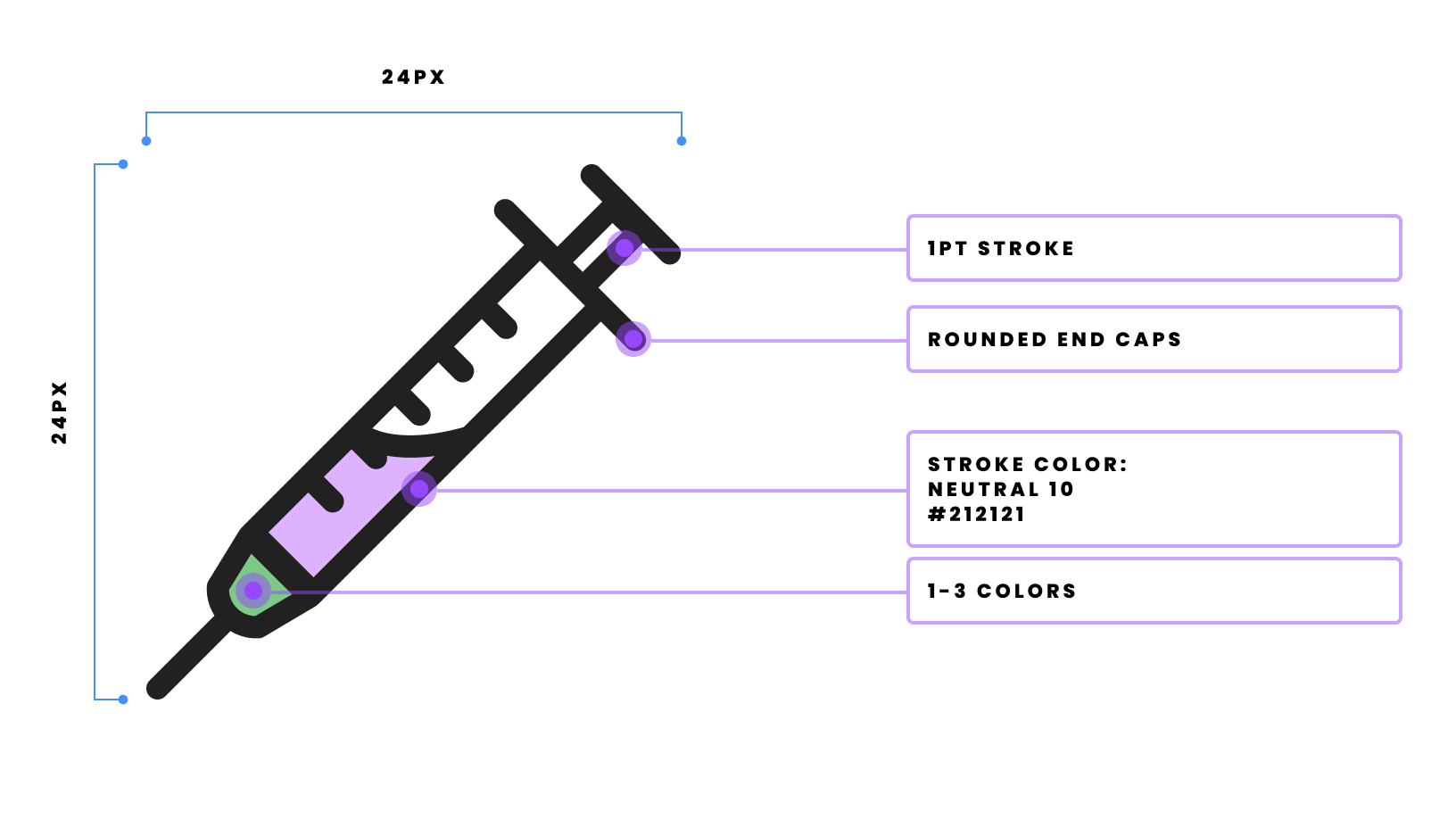
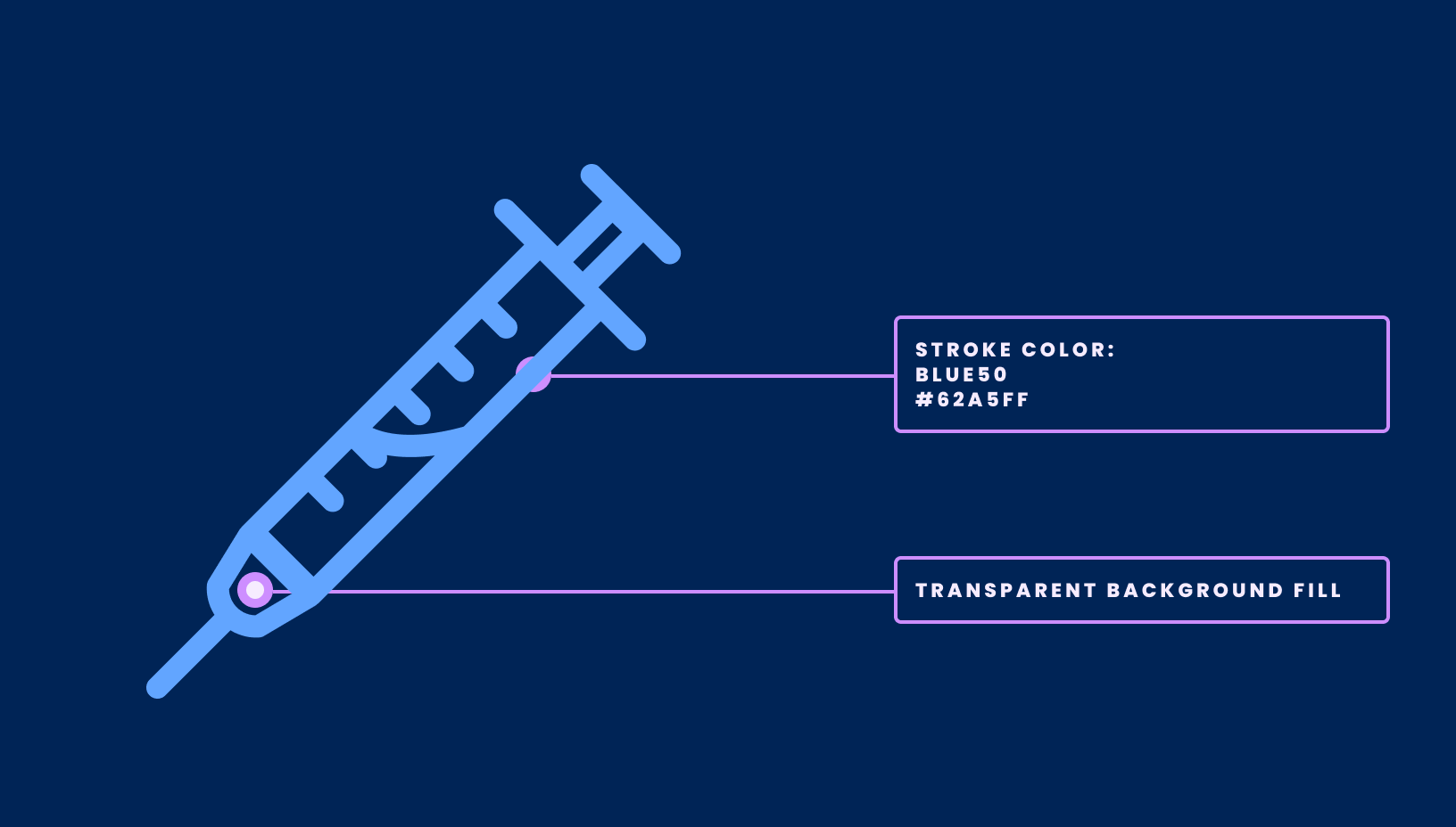
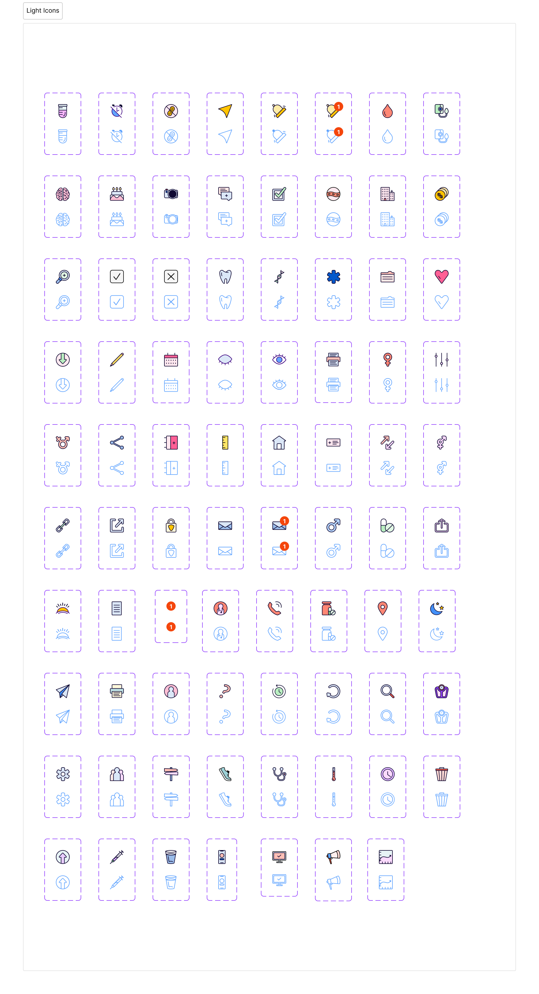
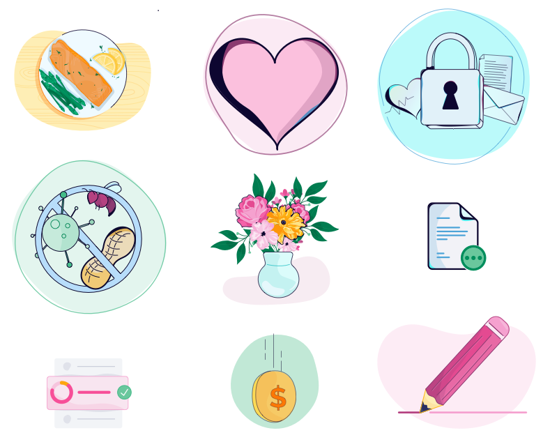
This is just a small fraction of the original library when I began. There was little to no consistency in style, color, or theme. While these are little in their day to day use, simply getting the icons cohesive has made a huge difference. Our app feels a little more connected and whole with just the icons getting a refresh.
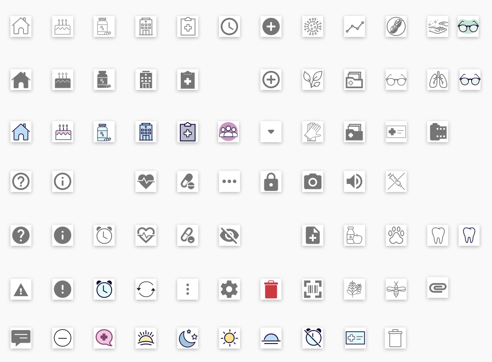
Here are a few examples of the updated icon library. I wanted them to feel vibrant, fun, and like they all belonged together. Not only is cohesion important, but having easily identifiable parts of a system can help users better understand the tool they are using.
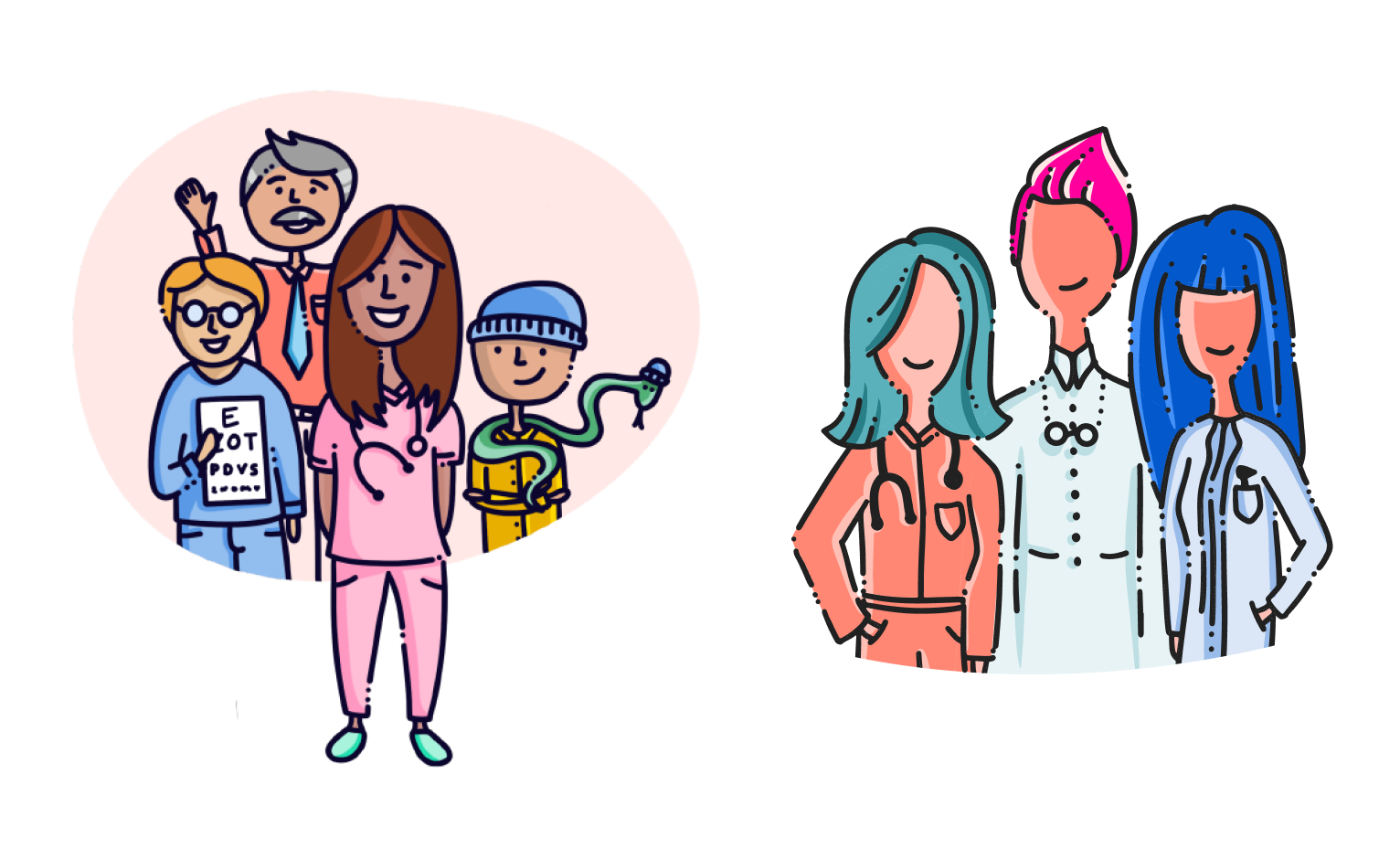
Illustration
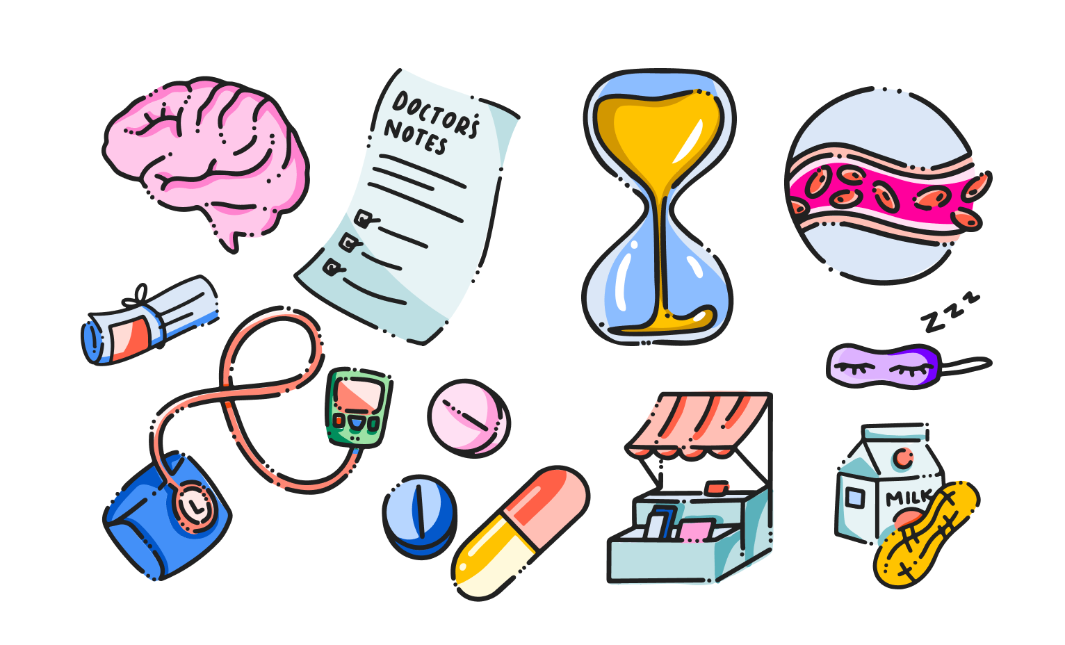
The next assets I worked on to refresh were illustrations that pop up pretty frequently throughout the app. Similarly to the icons, the styles of the illustrations were not defined and felt disjointed.
The original illustrations had various levels of detail, no definitive look, and jumped around from realistic to more stylized.
Original Illustrations
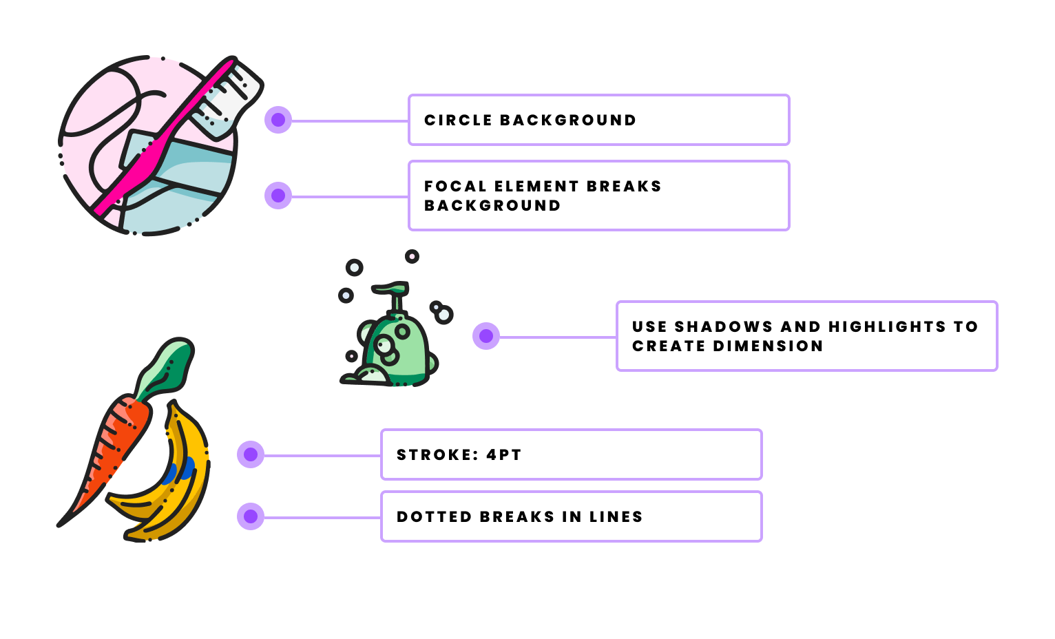
Incorporating the new color palette added some vibrancy and fun to the new illustrations while using the same line weight and shading style created a consistent pattern to follow.
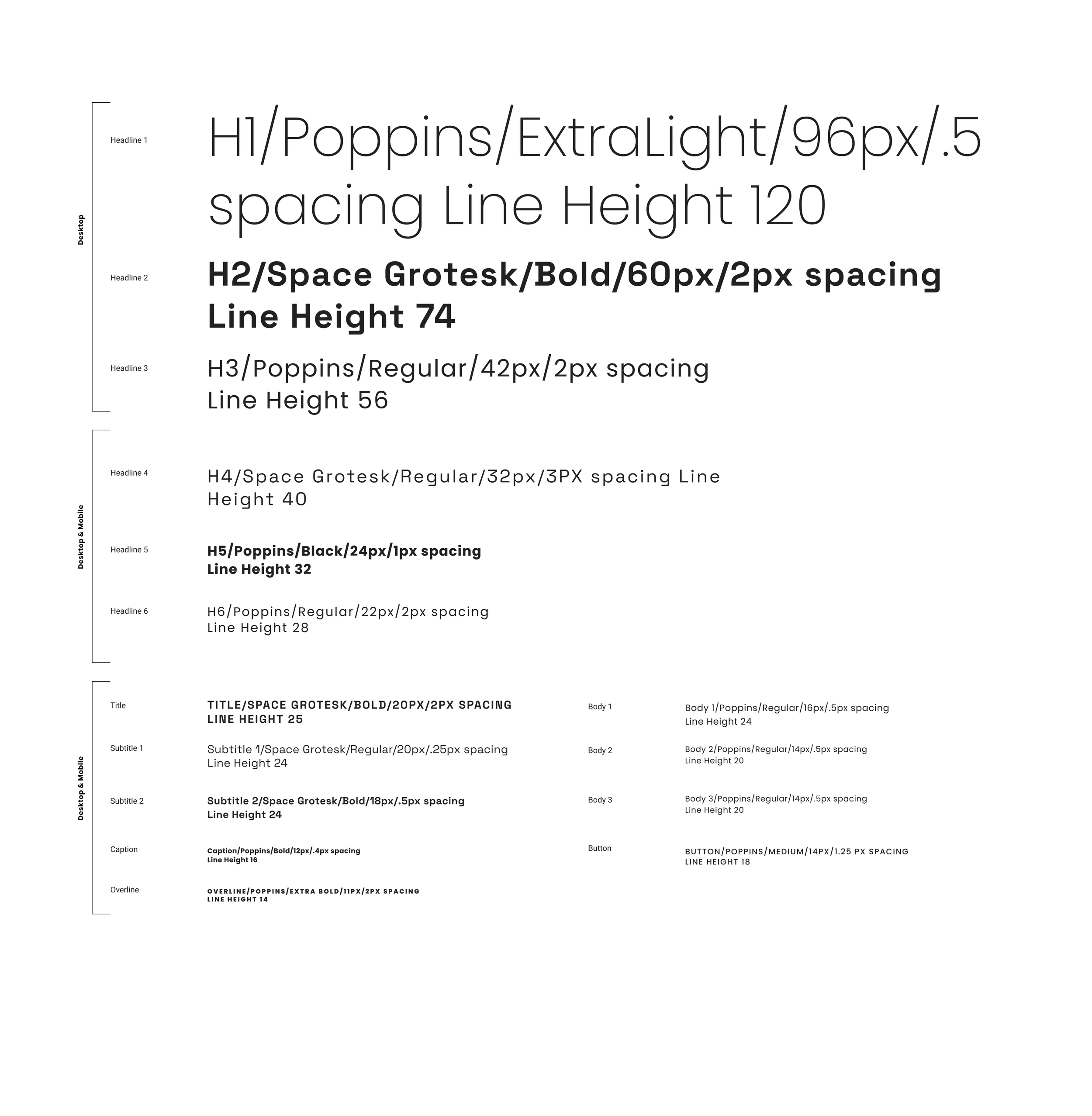
Typography
Our original app used Lato and Raleway - both are fine, however neither stood out too much when used together. I wanted our brand to have fun with type scale and weight, and landed on pairing Space Grotesk with Poppins.
UX/UI
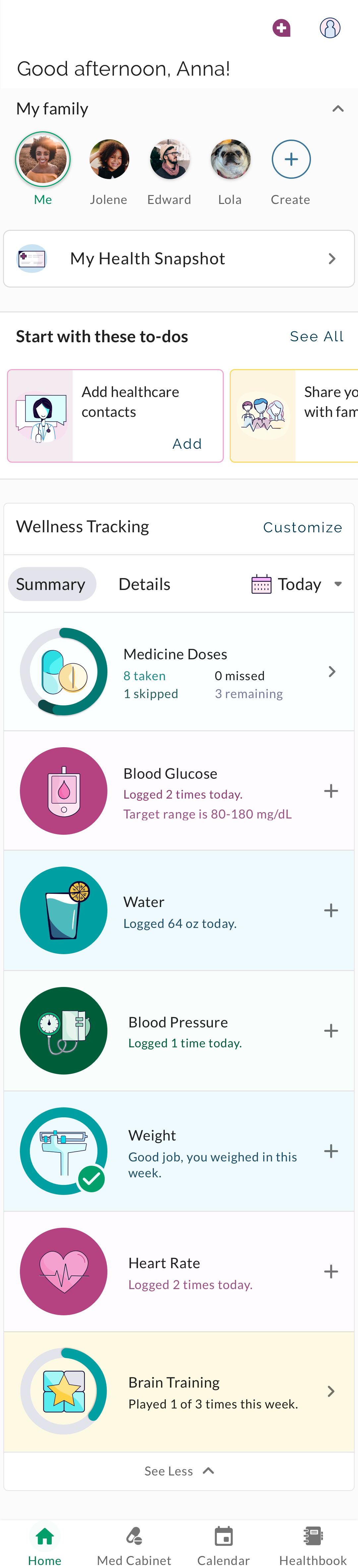
After spending time with color, icons, illustration, and other visual elements, I began to work on reimagining the home screen and our Healthbook screens. The first thing I noticed was a lot of space being used on the home screen, but not in an efficient way. As features were added, they piled on like a grocery list instead of being folded in with intent and reason.
Our current Home screen has large visuals that take up most of the space, pushing other areas out of view
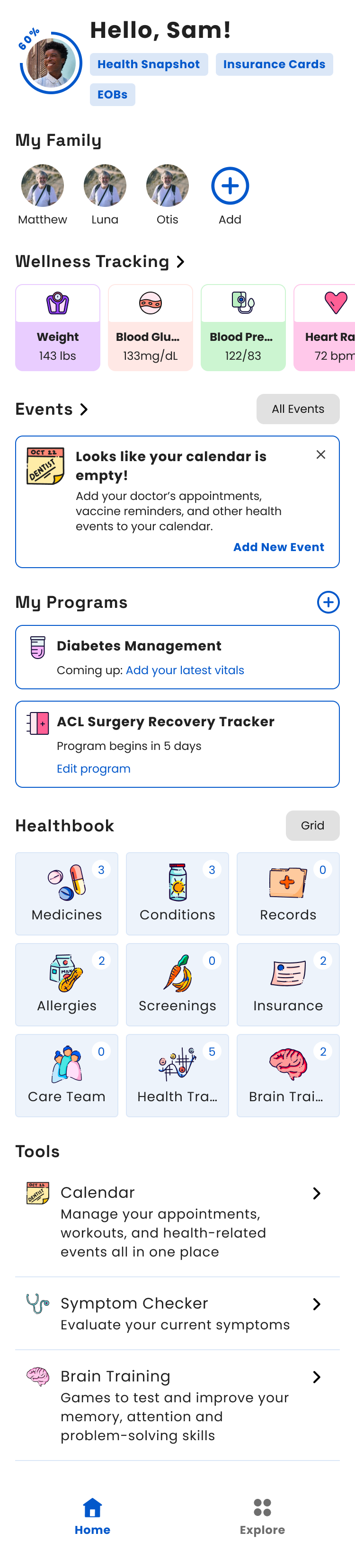
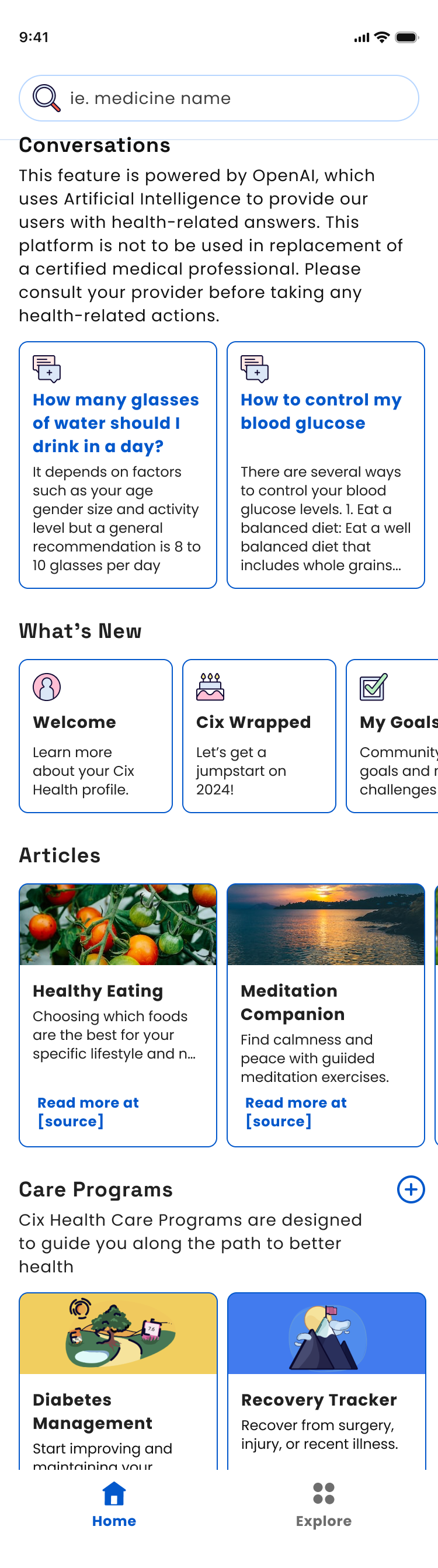
The updated Home screen redesign utilizes the space more efficiently by decreasing the size of the wellness tracking section and allowing more areas to appear beneath. This also meant we could decrease the amount of pages to navigate to on the bottom, and create an entire “Explore” section with new features like Articles, an AI chat feature, and wellness programs.
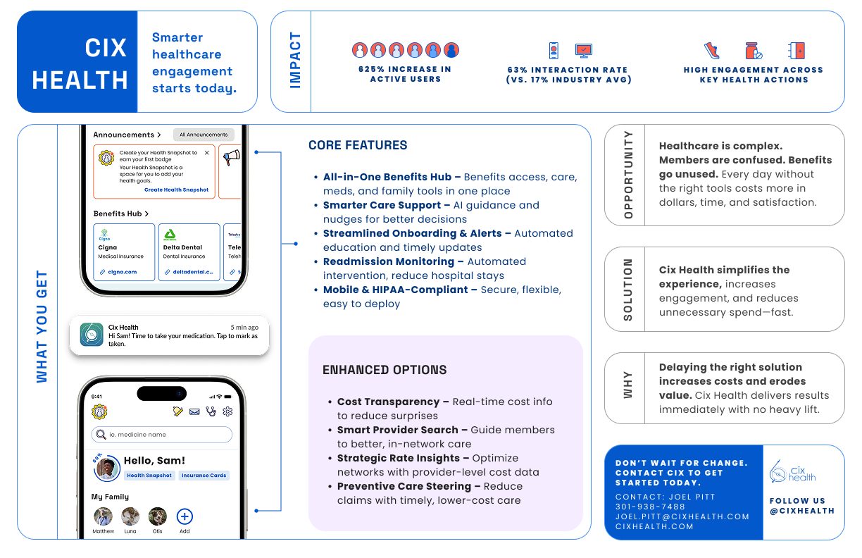
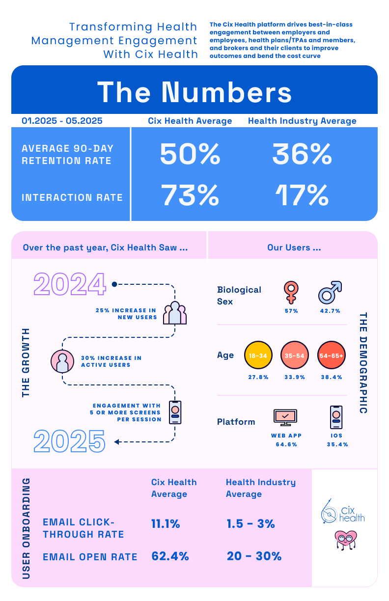
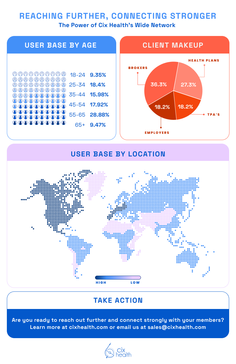
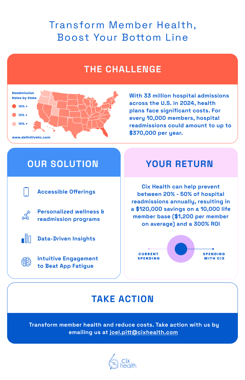
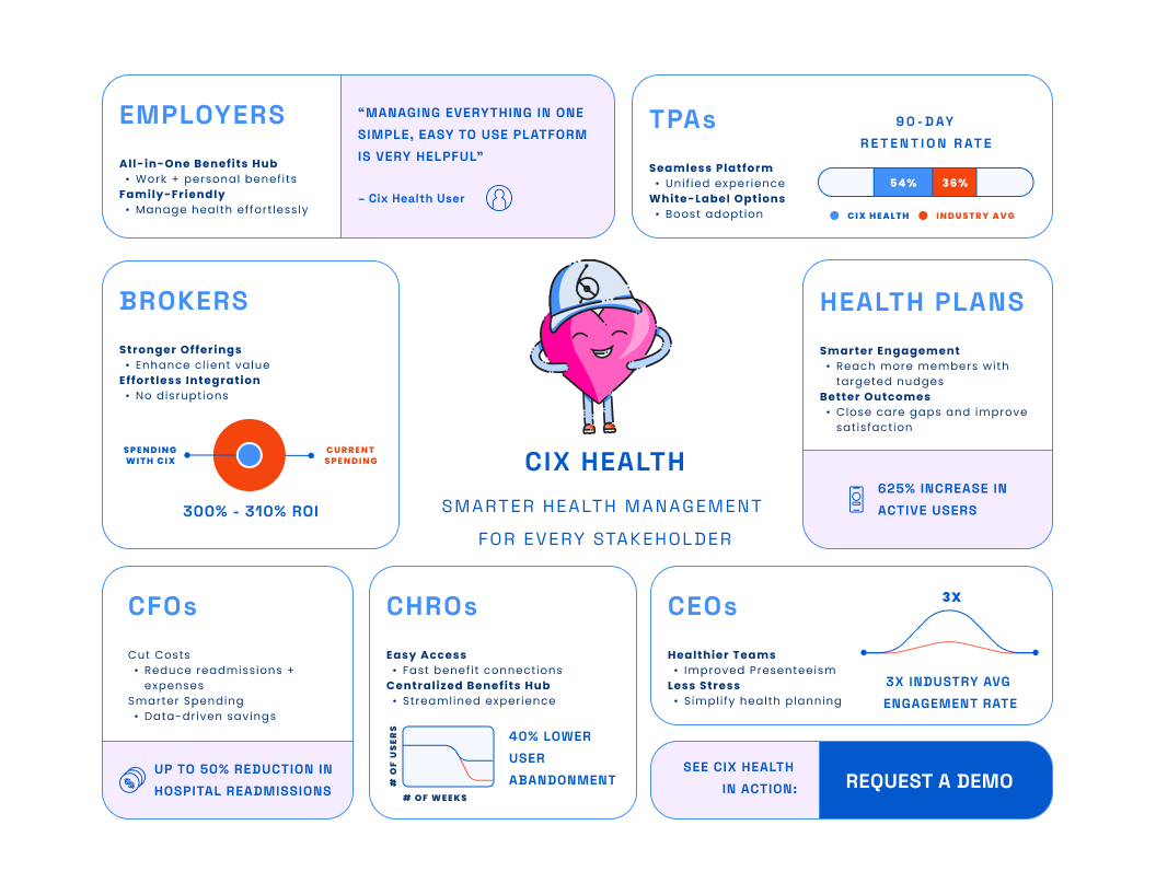
Sales Materials
These items are used for digital and print applications depending on our client needs.